Fork me on GitHub

HTML&CSS

CSS盒模型

基本概念

盒模型的组成大家肯定都懂,由里向外content,padding,border,margin.

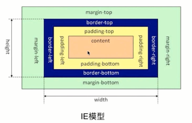
盒模型是有两种标准的,一个是标准模型,一个是IE模型。

1542077018582
1542077018582

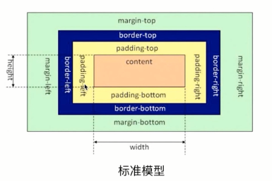
在标准模型中,盒模型的宽高只是内容(content)的宽高,

而在IE模型中盒模型的宽高是内容(content)+填充(padding)+边框(border)的总宽高。

css如何设置两种模型

这里用到了CSS3 的属性 box-sizing

1
2
3
4
5
/* 标准模型 */
box-sizing:content-box;

/*IE模型*/
box-sizing:border-box;

rem布局最终方案

Rem布局方案

通过上面可以得出最好的弹性布局方案是,rem+js方案,同时还要解决noscript问题,解决字体问题,解决屏幕过宽问题

但是上面的方案还有个问题,就是分成100份的话,假设屏幕宽度320,此时html大小是3.2px,但浏览器支持最小字体大小是12px,怎么办?那就分成10份呗,只要把上面的100都换成10就好了

下面给一个完整的例子,css的计算没有使用预处理器,这个很简单

html代码如下

1
2
3
4
5
6
7
8
9
10
11
12
13
14
15
16
17
18
19
20
21
22
23
24
25
26
<!DOCTYPE html>
<html lang="en">
<head>
<meta charset="UTF-8">
<meta name="viewport" content="width=device-width, initial-scale=1, maximum-scale=1">

<title>rem布局</title>
</head>
<body>
<noscript>开启JavaScript,获得更好的体验</noscript>

<div class="p1">
宽度为屏幕宽度的50%,字体大小1.2em
<div class="s1">
字体大小1.2.em
</div>
</div>

<div class="p2">
宽度为屏幕宽度的40%,字体大小默认
<div class="s2">
字体大小1.2em
</div>
</div>
</body>
</html>

css代码如下

1
2
3
4
5
6
7
8
9
10
11
12
13
14
15
16
17
18
19
20
21
22
23
24
25
26
27
28
29
30
31
32
33
34
35
36
37
38
39
40
41
42
43
44
45
46
47
48
49
50
51
52
53
54
55
56
57
58
59
html {
font-size: 32px; /* 320/10 */
}
body {
font-size: 16px; /* 修正字体大小 */
/* 防止页面过宽 */
margin: auto;
padding: 0;
width: 10rem;
/* 防止页面过宽 */
outline: 1px dashed green;
}

/* js被禁止的回退方案 */
@media screen and (min-width: 320px) {
html {font-size: 32px}
body {font-size: 16px;}
}
@media screen and (min-width: 481px) and (max-width:640px) {
html {font-size: 48px}
body {font-size: 18px;}
}
@media screen and (min-width: 641px) {
html {font-size: 64px}
body {font-size: 20px;}
}

noscript {
display: block;
border: 1px solid #d6e9c6;
padding: 3px 5px;
background: #dff0d8;
color: #3c763d;
}
/* js被禁止的回退方案 */

.p1, .p2 {
border: 1px solid red;
margin: 10px 0;
}

.p1 {
width: 5rem;
height: 5rem;

font-size: 1.2em; /* 字体使用em */
}

.s1 {
font-size: 1.2em; /* 字体使用em */
}

.p2 {
width: 4rem;
height: 4rem;
}
.s2 {
font-size: 1.2em /* 字体使用em */
}

js代码如下

1
2
3
4
5
6
7
8
9
10
11
12
13
(function (w, d) {
var documentElement = document.documentElement

function callback () {
var clientWidth = documentElement.clientWidth
// 屏幕宽度大于780,不在放大
clientWidth = clientWidth < 780 ? clientWidth : 780
documentElement.style.fontSize = clientWidth / 15 + 'px'
}

document.addEventListener('DOMContentLoaded', callback)
window.addEventListener('orientationchange' in window ? 'orientationchange' : 'resize', callback)
})(window, document)

750设计图的情况下使用方法

1
2
3
div{
height:500rem/50;
}

CSS样式格式化代码

1
2
3
4
5
6
7
8
9
10
11
12
13
14
15
16
17
18
19
20
21
22
23
24
25
26
27
28
29
30
31
32
33
34
35
36
37
38
39
40
41
42
43
44
45
46
47
48
49
50
51
52
53
54
55
56
57
58
59
60
61
62
63
64
65
66
67
68
69
70
71
72
73
74
75
76
77
78
79
80
81
82
83
84
85
86
87
88
89
90
91
92
93
94
95
96
97
98
99
100
101
102
103
104
105
106
107
108
109
110
111
112
113
114
115
116
117
118
119
120
121
122
123
124
125
126
127
128
129
130
131
132
133
134
135
136
137
138
139
140
141
142
143
144
145
146
147
148
149
150
151
152
153
154
/* css清除默认样式*/

html,
body,
h1,
h2,
h3,
h4,
h5,
h6,
p,
ul,
li,
ol,
dl,
dt,
dd,
div,
span,
a,
b,
i,
strong,
em,
img,
form,
input,
textarea,
table,
th,
td,
section {
padding: 0;
margin: 0;
}

html,
body {
font-family:'黑体', sans-serif;
width: 100%;
height: 100%;
overflow: initial;
}

body {
background: #F9F9F9 !important;
color: #333;
font-size: 14px;
-webkit-overflow-scrolling: touch;
}

h1,
h2,
h3,
h4,
h5,
h6 {
font-size: 100%;
line-height: 100%;
font-weight: normal;
}

li {
list-style: none;
}

a {
text-decoration: none;
display: inline-block;
color: #333;
-webkit-tap-highlight-color: rgba(0, 0, 0, 0)
}

/*a的默认下划线和字体颜色| 移动端点击蓝边*/

a:hover {
text-decoration: none !important;
color: @primary-color ;
cursor: pointer;
}

i,
em {
font-style: normal;
}

strong,
b {
font-weight: normal;
}

input[type=button],
input[type=submit],
input[type=file],
button {
cursor: pointer;
-webkit-appearance: none;
}

/*解决苹果手机默认的背景透明*/

input,
button,
select,
textarea {
resize: none;
outline: none;
border: none 0;
padding: 0;
font-family: '黑体', sans-serif;
}

input[type="search"] {
-webkit-appearance: none;
}

input::-webkit-search-cancel-button {
display: none;
}

li {
list-style: none;
vertical-align: top;
}

/*li里浮动,li不浮动,去3像素bug*/

a img {
border: 0;
}

/*a包img:去蓝色边框*/

img {
vertical-align: middle;
width: 100%;
}

/*a包img:去3像素bug*/

table {
border-collapse: collapse;
font-size: 100%;
font-weight: normal;
}

table,
tr,
th,
td {
padding: 0;
font-size: 100%;
font-weight: normal;
}